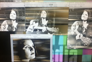
Today I changed a few of the shots around as when I rewatched the edit I felt that did not look right I also started looking at overlays as well. I started to look into how this would look as if it was the final product.
Friday, 14 December 2012
Thursday, 13 December 2012
what I did on Thursday 15th December
This is what I completed on thursday 15th december. I took some of the clips from the multi clips we built and started to build a final project. I managed to get most of the main structure down and in sync with the music.
what I did on Wednesday 12th December
As I waited for some work to render on final cut pro I decided to have a look at carrying the effect I used previously over different photos to see how it would look. The effect came out best over the bottom photo when their is a darker, blacker background. This caused the colours to show up more. I like the effect over the darker image as I felt that it made the image stand out more and become more eye catching.
Tuesday, 11 December 2012
Monday, 10 December 2012
End Of module 2
 |
| I contributed to this the day that we were planning to shoot on. |
 |
| I contributed to this shoot by controlling the lights and having an input into the positions of the artist and made an opinion on if I thought the framing of the shot was good or bad. |
 |
| I contributed to this some of the effects that we could use and contributed a number of the pictures used in the mood board itself. |
 |
| I contributed to this some of the props I felt that we would need to use on shoot day and what I could bring with me to have on shoot day. |
Thursday, 6 December 2012
Wednesday, 5 December 2012
multi clip performance bed and photoshop 5.12.12
Today I had a go at creating my own performance bed using the multi clip editing technique. This was a new technique that I had never used before and so took a while to get the hang of. Once I figured out how multi clipping worked and a few practice goes using it I found the technique quite easy and a lot of fun. It was amazing how you could edit live and see your work coming together right in front of you.
Beneath this here is a digipak design that I thought of and created by playing around with the paint tools, different colours and then using the motion blur to create this effect over the image. As the picture was already visually interesting and was amazing without needing to be edited I wanted to avoid putting too much effect over the top ad I didnt want to ruin the photo. I think that the picture on the right which only contain white paint blurred over the top looks visually interesting and more artistic and more harsh to look at than the one on the right. The picture on the right has white and beige colours blurred over the top and I feel this has created a more softer effect over the picture compared to the version on the right hand side. I think that both pictures look visually appealing and fit the image we are creating around our artist and to help decide which one will be used a final project to gain feedback from others.
Tuesday, 4 December 2012
examples of digipak designs
This my attempt at producing digipak covers from our photoshoot photos. I used motion blurs and the paint too to create the top design and used two different pictures and cropped them to make the second design.
Subscribe to:
Comments (Atom)


.tiff)


